


CALLIGRAPHY (ḵaṭṭāṭī, ḵᵛošnevīsī).
Introduction. The writing system in use in Persia since early Islamic times grew out of the Arabic alphabet. Comparison of some of the scripts that developed on Persian ground, particularly Persian-style Kufic, with the Pahlavi and Avestan scripts reveals a number of similarities between them, and this has led certain modern researchers to surmise that the Persians, when they adopted the Arabic writing system, may have made changes in the letter shapes and style of writing under the influence of their old national scripts and inherited tastes. Distinctive Persian features appear mainly in the taʿlīq, šekasta-taʿlīq, nastaʿlīq, and šekasta nastaʿlīq scripts (see Homāʾī, p. 532; Bayānī, p. 765; Fażāʾelī, 1350, pp. 394-402; and below).
I. The beginnings.
The Arabic script was derived from the Nabatean and Syriac scripts current in the Ḥawrān district of Syria and the Mesopotamian city of Ḥīra respectively; from the former derived the Arabic nasḵī script and from the latter the Kufic (also called Ḥīrī) script. After the establishment of Islam Arabic nasḵ was used mainly for correspondence and documents and Kufic for copies of the Qurʾān and later also for inscriptions on stone and on coins.
The development of the Arabic alphabet resulted in a number of identically shaped letters, which at first there was no means of distinguishing, but in the second half of the 1st/7th century distinguishing points and other marks (pointings) began to be commonly used. At the same time the short vowel signs called ḥaraka (plur. ḥarakāt: fatḥa for short a, żamma for short u, and kasra for short i) and other diacritical marks were invented. Almost a century passed before these devices were perfected.
Ebn Moqla (Abū ʿAlī Moḥammad b. ʿAlī Fārsī, 272/885-86 to 328/940). During the late Omayyad and early ʿAbbasid periods the use of written Arabic spread to Egypt, North Africa, and Persia, and new styles of writing were developed from nasḵ and Kufic; however, around the turn of the 3rd/9th and 4th/10th centuries, Ebn Moqla, a vizier in the service of the caliph al-Moqtader, and his brother Abū ʿAbd-Allāh Ḥasan (d. 338/949-50) put a stop to the proliferation of different styles. They selected fourteen styles and by improving the pens used, by defining the geometric shapes of the letters, and by setting down the 12 essential rules of calligraphy they brought the art under a measure of discipline. In their system the basic components of handwriting were straightness (saṭḥ) and roundness (dawr).
Ebn Moqla’s rules of calligraphy, set forth in his Resālat al-ḵaṭṭ wa’l-qalam (Cairo, Dār al-Kotob, no. 4; see also Qalqašandī, III, pp. 143-52), fell into two categories: the first category was good shaping (ḥosn-e taškīl, which concerned relative sizes, roundness and straightness, and tallness and shortness of letters, thinness or thickness of strokes, vertical, horizontal, and oblique straightness, etc., the two basic principles being respect for the elements (oṣūl) and the proportions (nesba). The second category was good layout (ḥosn-e ważʿ), which concerned ligatures of joinable letters, positions of detached letters, gaps between words ṭarz-e mojāvarat), spaces between lines (neẓām), elongations (madd) to equalize margins, etc., the two basic principles being composition (tarkīb) and seating (korsī). After Ebn Moqla other calligraphers gradually elaborated these principles and formulated them in eight, twelve, or more rules.
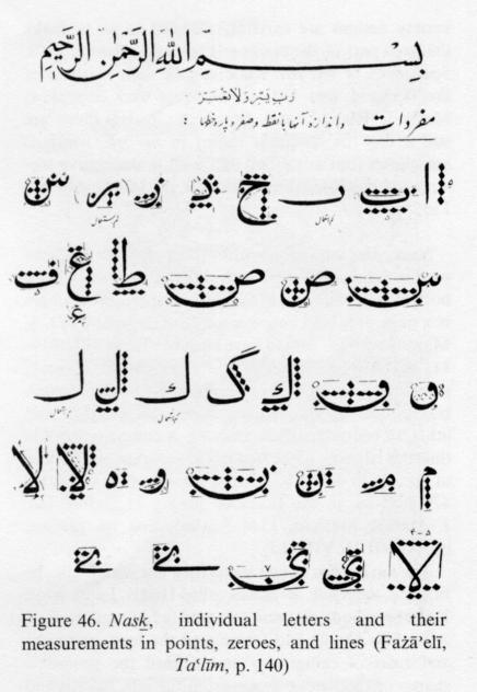
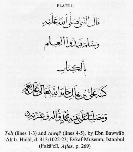
Ebn al-Bawwāb (Abu’l-Ḥasan ʿAlī b. Helāl Baḡdādī, d. 413/1022-23). After Ebn Moqla, Ebn al-Bawwāb added some new rules to the twelve traditional ones, paying special attention to nib cutting and ink selection (see below); improved the ṯolṯ (ṯoloṯ), nasḵ, and reqāʿ scripts (see below); and initiated the practice of measuring letters in points to set standards for the heights of tall letters (e.g., alef, lām), the length of an elongation in a particular context, or the size of a semicircle (e.g., of cf. qāf, lām, nūn; cf. Figure 46). Today calligraphy teachers usually make these points hollow to avoid confusion with the pointings, but “half-points” are written as an Arabic zero (= a European full stop).
Yāqūt Mostaʿṣemī (Jamāl-al-Dīn Abu’l-Majd; d. 696/1296-97 or 698/1298-99). Ebn al-Bawwāb trained a large number of pupils, and during the next two centuries calligraphy flourished. The next great master to appear was Yāqūt Mostaʿṣemī, who picked six scripts (ṯolṯ, nasḵ, rayḥān, moḥaqqaq, tawqīʿ, reqāʿ) to improve and make more beautiful. These six, known as the setta-ye yāqūtī and as the ḵoṭūṭ-e oṣūl gradually supplanted all the others except Kufic.
Since an adequate discussion of scripts and calligraphy is impossible without some knowledge of the rules established by Ebn Moqla and his followers, they are briefly summarized here in the form of general guidelines derived from Ebn Moqla’s four basic principles of respect for the elements (oṣūl), proportions (nesbat), composition (tarkīb), and seating (korsī).
1. “Respect for the elements” means giving all the letters of the alphabet proper degrees of “boldness” (qūwa/qowwa) or “faintness” (żaʿf) and proper shape (the following examples are taken from Fażāʾelī, Taʿlīm, pp. 82-83). Boldness is obtained by pressing the whole of the tip of the nib as hard as possible on the paper; it is required in the middle and end parts of elongations (Example 1), in the middle parts of semicircular final flourishes (Example 2), and on the tops of dāl, fā, qāf, wāw, etc. Faintness is obtained by using the corner or part of the tip of the nib. It is required in the starts and middle parts of most letters and in the end parts of certain letters which ought to be made thin (Example 3).
Straightness (saṭḥ) is obtained by direct movement of the pen in strokes which may be horizontal, vertical, or oblique. Since it is most conspicuous in the elongations of certain final letters (Example 4) and in optional elongations (Example 5), the term “straightness” most often refers to horizontal strokes and then means the same as “flatness.” The opposite of straightness, roundness (dawr), is obtained by swinging the pen in such a way as to make a retroverted or upturned semicircle (Example 6) or a loop as at the top of fā, qāf, wāw, etc. Both gentle and forceful movements of the pen are required, for which particular skill is needed.
Heightening (ṣoʿūd) is of two kinds: “real” (ḥaqīqī), which means heightening final alefs, median lāms, and final kāfs (Example 7) and “unreal” (majāzī) which means raising the end of the letter when the pen is making a dawr (Example 8).
Lowering (nozūl) is also “real” or “unreal”; “real” lowering applies to detached alef, lām, and kāf, to initial lām, kāf, and to the tail of mīm (Example 9), and “unreal” lowering means lowering the starts of semicircles and some elongations and the crossbars of kāf and gāf (Example 10).
When “real” heightening and lowering are performed similarly shaped letters are kept parallel to each other.
The terms “blackness” and “whiteness” (sawād o bayāż) refer to the balance between the loops of letters such as jīm, ṣād, żād, ṭā, ẓā, ʿayn, fā, qāf, and hā and the white background showing inside them.
“Release” (ersāl) means letting the pen move freely in writing certain letters, for example in flattening rā, wāw, and final mīm (Example 11), long tā and nūn (Example 12), and some other letters in the šekasta script (Example 13).
Solṭān Alī Mašhadī considered ersāl to be inadmissible in the nastaʿlīq script.
2. “Proportion” (nesba or tamāsob) means that identically or similarly shaped letters, whether detached or joined, should be of the same size in all contexts. Rāvandī (p. 441) applied the term mansūb (well-proportioned) to writing which conformed to this basic principle.
3. Composition (tarkīb) is the most important factor in calligraphy. It is the arrangement of letters and words (tarkīb-e jozʾī), sentences, and lines (tarkīb-e kollī) to produce a beautiful layout. This is a particularly demanding task in the case of inscriptions, where the space is limited. Adequate space must be left between the letters, words, and lines and on the page. Written matter and background and “boldness” and “faintness” must be consistently balanced, and elongations must be used to obtain symmetry. Words and letter combinations must be constructed and “seated” so as to fit in with whatever is adjacent. The ḥarakāt (fatḥa, żamma, kasra, jazm or sokūn, tanwīn) and other diacritical marks (tašdīd, madda, ḥamza-ye qaṭʿ, ḥamza-ye waṣl), pointings, and ornaments must be suitably placed. Elongations, whether elemental or optional, are of great importance for good composition and calligraphy, as they relieve monotony and impart symmetry and beauty to a piece of writing. In the nastaʿlīq script a full elongation should not be placed at the beginning or end of a line or hemistich, but only in the middle, though the placing of a medium or short elongation at the beginning or end is permissible.
4. “Seating” (korsī) refers to the placement of the letters and words of a line or hemistich in relation to each other and to the “horizon” of the line, or ḵaṭṭ-e korsī, of which there are five: raʾs al-ḵaṭṭ: for the top of alef, uncrossed kāf, and lām; for the top of dāl, rā, ṣād, ṭā, ʿayn, fā, qāf, mīm, wāw, and hā; wasaṭ: for the bottom of alef and lām, for bā etc., for the starts of the semicircular final flourishes of jīm and ʿayn, and for the flattened last stroke of kāf; for the bottom of dāl, rā, and final sīn, ṣād, qāf, nūn, and yā; and ḏayl al-ḵaṭṭ: for the bottom of final jīm, ʿayn, and the like.
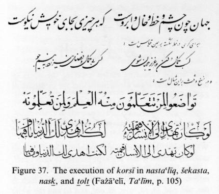
Some calligraphers recognize only three seat plans, middle, upper, and lower, in all the scripts, while some others recognize four (Figure 37). Today the ḵaṭṭ-e korsī is also known as the ḵaṭṭ-e zamīna (background line) or ḵaṭṭ-e ḥāmel (supporting line).
“Refinement” (ṣafā) and “dignity” (šaʾn) are the terms in use to denote the excellence of handwriting (also called rawnaq and āb) a calligrapher of talent and skill in the four basic principles can attain. Refinement makes looking at the writing a pleasure, and dignity gives it charm and relieves it of monotony. These two qualities determine what impression (maza, aṯar) the writing will produce. A calligrapher whose work has achieved them may develop a style (šīva) of his own, which may transcend principles and rules and manifests itself in artistic touches and special execution of the writing that set it apart from the work of others and can be recognized by connoisseurs.
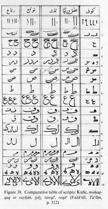
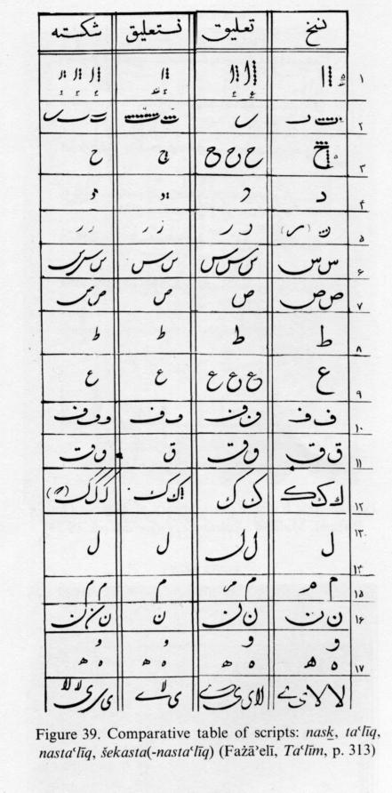
For a clear appreciation of the differences of letter shape and size in the various script, the following points should be kept in mind (see Figure 38, Figure 39, Figure 40): 1. the length of the alef measured in points, important because the sizes of the other letters are measured with reference to the number of points in the alef; 2. the particular shape of each letter, both when standing alone and when joined by a ligature; 3. the shape of the letter, whether consistent or erratic and whether easily legible and graceful; 4. the spaciousness or crampedness, the proportion of straight to round strokes, the openness or blotching of the so-called eyes (čašm) and loops, and the presence or absence of tufts (sarak, ṭorra) on letters; 5. the size of the elongations, ranging from a full elongation, which may be three times as long as an alef, to a short elongation; 6. whether a pen is moved rapidly or slowly; and 7. the special purposes for which each script was used (see Fażāʾelī, 1366, pp. 286-313).
To teach calligraphy practice sketches (sīāh-mašq) and models for practice (sar-mašq) have been in common use. Sīāh-mašqs are sheets on which a calligrapher has written rows of letters and letter combinations for practice, usually in nastaʿlīq or šekasta-nastaʿlīq. Besides attesting to the skill and zeal of the writer, a sīāh-mašq often has a pleasing appearance and sometimes displays virtuosity. For this reason practice sketches by leading masters are included in the treatises on calligraphy (Plate XXVII). Sar-mašqs are specimens of good handwriting that teachers give pupils to copy out for practice. Collections of sar-mašqs are reproduced and published in textbooks, and recently works of great masters have been made available to students of calligraphy.
The following scripts will be discussed here: Kufic, nasḵ, moḥaqqaq, rayḥān, ṯolṯ, tawqīʿ, reqāʿ, ḡobār, taʿlīq, nastaʿlīq, šekasta-nastaʿlīq and šekasta, ṭoḡrā.
Kufic. The Kufic script was in common use in Persia for five centuries following the Arab conquest, mainly for copying the Qurʾān and for decorating buildings, vessels, and books. See note. The use of decorative (mošajjarī) Kufic script attained its highest artistic perfection in Persia, where it was widely used up to the 10th/16th century and continued thereafter to be cultivated up to the present time (Figure 41, Figure 42).
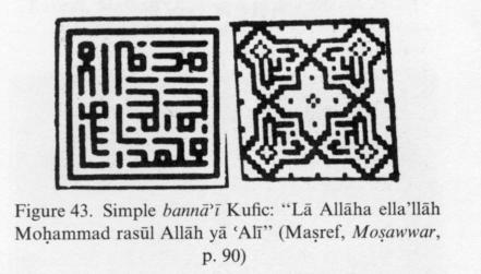
Two main styles of Kufic script can be distinguished: One, used in manuscripts, has simple shapes, of which one-eighth to one-sixth are round and the rest straight; when used for decorative purposes it is called mowaššaḥ or tazyīnī. The other, used on buildings, is entirely straight and is called maʿqelī or bannāʾī; its degree of legibility depends on the design.
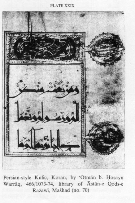
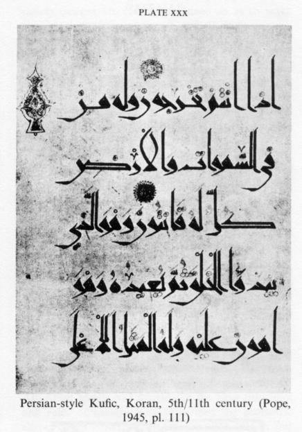
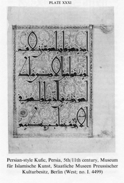
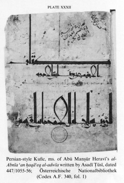
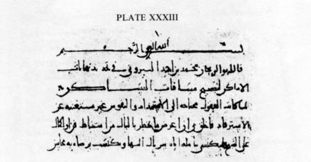
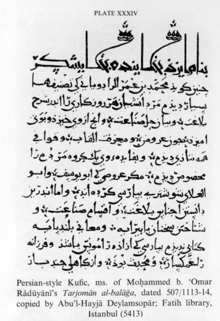
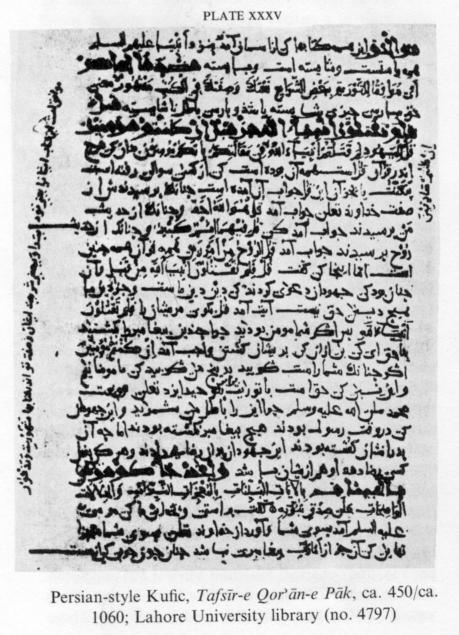
In several surviving specimens of manuscript Kufic the letters have been written separately and then joined by hair-thin lines written with the comer of the nib. Some modern scholars regard this as a distinct style resembling Pahlavi and Avestan writing; they therefore describe it as Persian-style Kufic (e.g., Bayāni, 1342, p. 765). The following early manuscripts are considered to be in the so-called Persian-style Kufic: a folio of the Qurʾān in the library of the Āstān-e Qods-e Rażawī at Mašhad (Plate XXVIII; see Rāhnamā, pp. 28-29); part of the Qurʾān written by ʿOṯmān b. Ḥosayn Warrāq and dated 466/1073-74 in the same library (Plate XXIX; see Rāhnamā, pp. 45-49); Qurʾān written in the 5th/11th century, in the Toledo Museum of Art (Plate XXX); some folios of the Qurʾān written in Persia in the 5th/11th century, in Berlin (Plate XXXI); ms. of the Ṣefāt al-Šīʿa of Shaikh Ṣadūq (see Fażāʾelī, 1350, pp. 129-30, 401, and Homāyūn-Farroḵ, 1346, pp. 33-45); ms. of the al-Abnīa ʿan ḥaqāʾeq al-adwīa of Abū Manṣūr Heravī, written by Asadī Ṭūsī, in the Vienna Public Library (447/1055-56; Flügel, II, pp. 534-36, photographic repr. Tehran, 1344 Š./1965; Plate XXXII); ms. of the Taḥdīd nehāyat al-amāken le-taṣḥīḥ masāfāt al-masāken of Abū Rayḥān Bīrūnī, dated 416/1025 and probably in the author’s own handwriting, in the Fatih library, Istanbul (Plate XXXIII); ms. of the Tarjomān al-balāḡa of Moḥammed b. ʿOmar Rādūyānī, dated 507/1113-14 and copied by Abu’l-Hayjā Deylamsopār, in the Fatih library, Istanbul (Plate XXXIV; see Ahmet Ateş’s ed. of the Tarjomān al-balāḡa, Istanbul, 1949); Tafsīr-e Qorʾān-e pāk, in Lahore University library (Plate XXXV; photographic repr. Tehran, 1344 Š./1965).
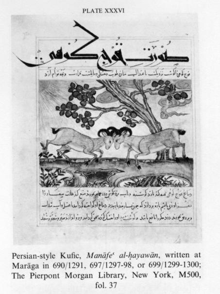
Persian-style Kufic has been fully described by Fażāʾelī (1350, pp. 128-33, 398-401). Among modern researchers, Rokn-al-Dīn Homāyūn Farroḵ is alone in identifying the script of the above-named and some other manuscripts, including the chapter titles (ʿonwān) of Manāfeʿ al-ḥayawān written at Marāgā in 690/1291, 697/1297-98, or 699/1299-1300, now in the Pierpont Morgan Library, New York (Plate XXXVI), with the Pīrāmūz (Fīrāmūz, Qīrāmūz) script mentioned by Ebn al-Nadīm (ed. Tajaddod, p. 9; ed. Flügel, p. 6; see Homāyūn-Farroḵ, 1346, 1350a, pp. 40-42, 1350b, pp. 735, 764). Aḥmad Goḷčīn-e Maʿānī has suggested that the Qurʾān folio in the Āstān-e Qods library (Plate XXXVIII) may be Pīrāmūz (Rāhnamā, pp. 28-29). These surmises, however, are unproved and not supported by other researchers.
In Kufic the bottoms of alefs are usually bent backward. In some varieties the pen is moved slowly, in others quite quickly, but in general more slowly than in other scripts, and it cannot be swung back freely. Some styles, for instance maʿqelī, acquire a virtually pictorial appearance.
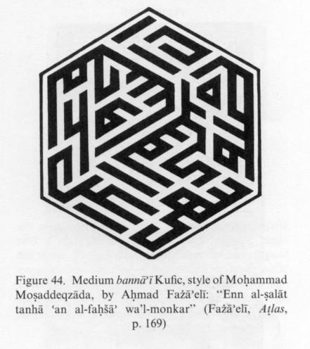
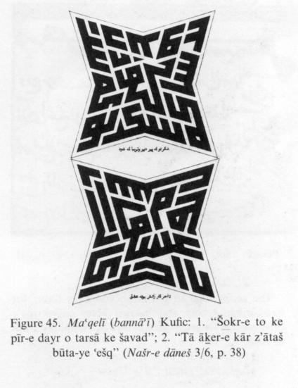
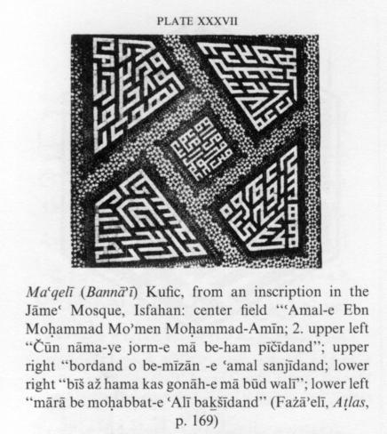
The maʿqelī or bannāʾī style is an unadorned form of Kufic consisting entirely of straight lines set vertically or at acute or obtuse angles. The amounts of “blackness” (i.e., written matter, not necessarily black) and “whiteness” (e.g., background, not necessarily white) are as a rule carefully planned so as to mark off words or groups of words. Its legibility depends on the width of the spacing and the extent of the use of extraneous lines and frills to fill gaps (Figure 43). In maʿqelī Kufic of medium legibility the spaces are not large, and extraneous lines are not inserted (Figure 44). In the difficult variety designs are carefully planned so as to make the gaps part of the reading (Figure 45, Plate XXXVII). Specimens of maʿqelī Kufic can be seen in some of the Timurid and Safavid mosques and edifices at Mašhad, Isfahan, and elsewhere. Today there are still a few tile designers expert in maʿqelī, which is sometimes (but not often) still used in decorative tilework on buildings (Fażāʾelī, 1350, pp. 160-72; Maʿrūf, 1365, pp. 36-37).
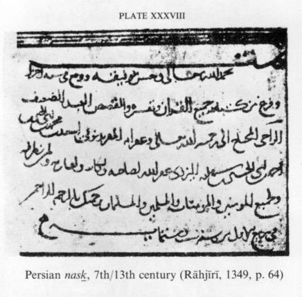
Nasḵ. For ordinary writing purposes the Persians used a variety of nasḵ which differed somewhat from both the old and new style of nasḵ. The earliest example is a page of a land conveyance deed thought by D. S. Margoliouth (p. 761) to have been written in 401/1010-11, but it may be older. A similar variety of nasḵ, sometimes looking almost like taʿlīq, is found in Persian translations of the Qurʾān up to the 5th/11th and 6th/12th centuries (Plate XXXVIII). A complete work in this style is the ms. of the Hedāyat al-motaʿallemīn fi’l-ṭebb of Abū Bakr Rabīʿ b. Aḥmad Aḵawaynī, dated 478/1085-86, in the Bodleian library at Oxford (ed. J. Matīnī, Mašhad, 1344 Š./1965, and his preface, pp. XLVII-XLVIII, LI).
The nasḵ script at first stood on a par with Kufic. Its original, defective, form was called Ḥejāzī. Later, while Kufic became an art, nasḵ was used for communication. After Ebn Moqla had formulated the basic principles and rules of calligraphy and defined the geometric shapes of the letters, that is from the late 3rd/9th and early 4th/10th century onward, nasḵ advanced beyond its primitive phase and in the course of time attained such a degree of beauty that most Korans and other books came to be written in it.
The great merit of nasḵ is its respect for proportions. The sizes of identically or similarly shaped letters are uniform and consistent. The letters and words are not large, but they are well balanced. It is this proportionality and balance that lend beauty to the script. It is full, neat, and clear and easy to read correctly, and when the ḥarakāt are inserted the reading is unmistakable. Balance is obtained by equal distribution of flat and circular forms (roughly half straight and half round) and by heavy and light movements of the pen (Figure 46).
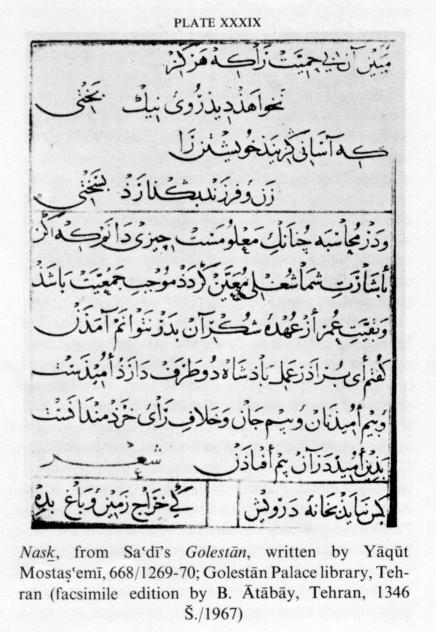
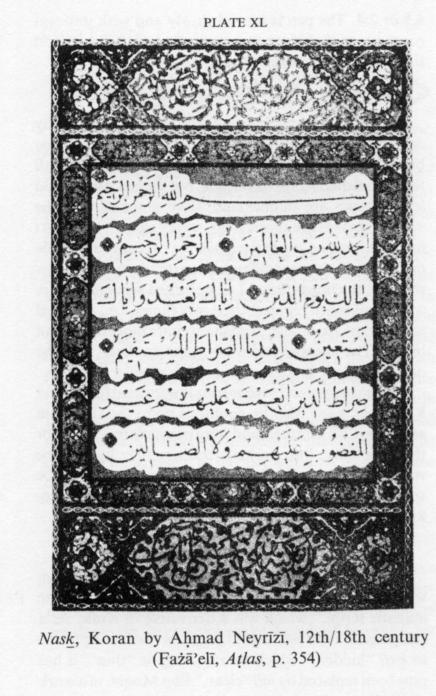
After Yāqūt Mostaʿṣemī, the Arabic style that he and his pupils had developed was for a long time accepted in the six scripts (Plate XXXIX). Some of his leading pupils and exponents who were Persian contributed a lot to the progress of calligraphy, and Khorasan, Fārs, and Azarbaijan were the main centers of the art and the seats of its chief masters in the 8th-10th/14th-16th centuries. At the end of the Safavid period, Aḥmad Neyrīzī (d. 1155/1742) made some experiments with nasḵ and adopted the style known as Persian nasḵ, which remains current today (Plate XL). Modern nasḵ is customarily not ornamented except when used for inscriptions and for short texts.
Modern nasḵ (its ordinary printed variety is called ḵaṭṭ-e mīāna) has been further developed to meet the requirements of typography and typing. It is the script in which the Qurʾān and all kinds of books, newspapers, and periodicals are now printed in Persia, Afghanistan, and the Arab countries. The ḥarakāt and other signs are not inserted, except in printed Korans (where a slightly different variety of nasḵ is used), ḥadīṯ texts, and prayers.
The script used in the Arab countries today for handwritten letters and hurried notes called roqʿa originated in Ottoman Turkey and is a simplified form of nasḵ.
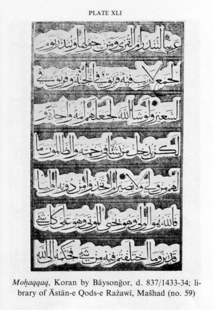
Moḥaqqaq. This script was developed from Kufic in the early ʿAbbasid period (Ebn al-Nadīm, ed. Flügel, p. 9) and is the closest to Kufic; moreover it was the first script to be systematized and geometrically defined by Ebn Moqla, though subsequent masters introduced refinements. It is significant both on account of its antiquity and because of Ebn Moqla’s definition of it. Yāqūt Mostaʿṣemī chose it as one of the “six scripts.” It is a stately but simple script, with large-sized letters and regular spaces and is used for writing Korans and other precious books. Each letter has a definite individual and consistent shape, and the words are never entangled. Thus, the great merit of moḥaqqaq is its legibility. Alef, kāf, lām, and the “handle” of ṭā are taller than in other scripts. The whole of each word usually lies on the same line. The loops of median and final ʿayn and the eyes of fā, qāf, wāw, mīm, hā, and lām-alef in all positions are open. The loops of initial, median, and final ṣād and ṭā, etc., and also the semicircular final flourishes are kept as shallow as possible in this script but are relatively wide. Detached alef, kāf, initial or detached lām, the “handle” of ṭā, and initial bā, etc., are written with a tuft, or in Turkish a so-called curl (ẓolf), that is, a small blob no bigger than a dot at the start of the stroke; tufting is called sarak, ẓolf, ṭorra, and tarwīs. The proportion of round to straight strokes in moḥaqqaq is estimated at 1.5: 4.5 or 2:4. The pen is moved slowly and with uniform pressure, so that there is no variation of thickness and thinness in the strokes (Plate XLI, Plate XLII).
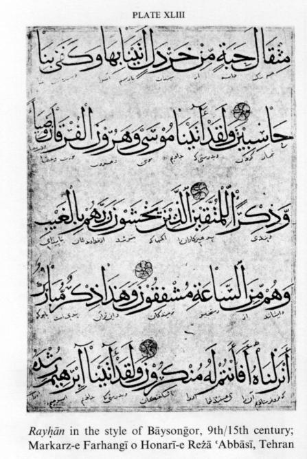
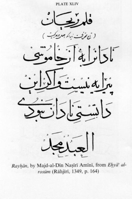
Rayḥān. This script (also called rayḥānī), reputedly devised by Ebn al-Bawwāb, is a derivative of moḥaqqaq but did not come into use until many years later. It has all the special qualities of moḥaqqaq, but the pen strokes and letter shapes are thinner and more graceful, and the vertical strokes are shorter. It is a very elegant script. At first sight moḥaqqaq and rayḥān may seem to resemble ṯolṯ, but there are clear differences particularly in the letter shaping: the bowls (kāsa, i.e., upturned semicircles) are wider and more regular, the bows (qaws, i.e., inverted semicircles) are smaller, and the eyes are more open than in ṯolṯ. The ḥarakāt and other signs are finer, and the ornamentation is sparser and much simpler.
The moḥaqqaq and rayḥān scripts were used for writing Korans in many Muslim countries up to the 10th/16th and 11th/17th centuries and were particularly valued for their legibility; but, perhaps because they have to be written slowly and the necessary time could not be spared, they gradually fell out of use. Rayḥān (Plate XLIII, Plate XLIV) endured longer than moḥaqqaq.
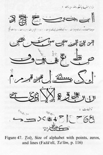
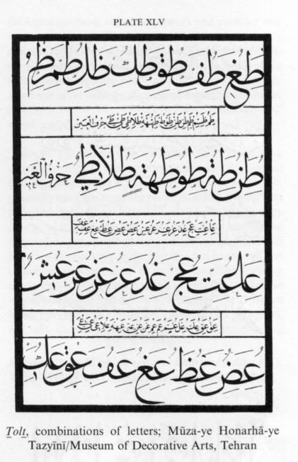
Ṯolṯ. The ṯolṯ script appears to have evolved through several channels from a style called ḵaṭṭ-e jalīl “the majestic script,” which was a derivative of Kufic. As a calligraphic term jalīl meant large or “fat” as opposed to ḵafī “hidden,” which meant small or “thin”; it has now been replaced by jalī “clear.” Ebn Moqla, in a work entitled Aṣnāf al-kottāb (ms. no, 1723 in the Public Library at Rabat, Morocco; quoted by Nājī Zayn-al-Dīn, p. 408), makes the following statements about the use of ṯolṯ in his time: “The style which was most often used and was clearer than the other styles was the ṯolṯayn style. Kings and high officials wrote their decrees and decisions in it, and they called it sejellāt (scrolls). As a result of improvements made by Fażl b. Sahl Ḏu’l-Rīāsatayn in the reign of the ʿAbbasid caliph al-Maʾmūn from then onward the dispatches of viziers to officials (ʿommāl) were sent in ṯolṯ, and the replies of officials to viziers were written in the small (ṣaḡīr) ṯolṯ script.” This implies that a large ṯolṯ script was then also in use.
Opinions differ on the question why this script was called ṯolṯ (lit. “one-third”). The most widely accepted explanation is Ebn Moqla’s statement (quoted by Qalqašandī, III, p. 52) that in “ṯolṯayn two-thirds of the letters are straight and one-third round, and in ṯolṯ one-third are straight and two-thirds round.” Qalqašandī himself states that “ṯolṯ mostly tends to be round” (pp. 62, 104). In writing ṯolṯ some special touches are required. One is to make the ends of final flourishes sharp and hair-thin by using the edge of the nib (tašʿīr). Another is to put a tuft at the top of a detached alef, dāl, and ḏāl, a detached or initial jīm, ṭā, kāf, lām, and initial bā, tā, and the like, as shown in Example 14 and Example 15 (from Fażāʾelī, p. 237).
The loops or eyes of ṣād, ṭā, ʿayn, fā, qāf, mīm, wāw, hā, and lām-alef must be open, as blotching (ṭams) is not permitted. Qalqašandī mentions ḵafīf “light” and ṯaqīl “heavy” varieties of ṯolṯ and describes the letters in light ṯolṯ as thinner and more graceful. Gradually the term ṯolṯ came to designate all the varieties of the script.
The fundamental characteristic of ṯolṯ is the predominance of “round” components and the easy gentle movement of the pen, which is evident from the script. In writing ṯolṯ the pen moves so sinuously that it has been said to “dance.” Ends of letters have thin and delicate “tails” that slope downward, either with a final flourish (pīčīdagī) or left free (ersāl). The bows and bowls are sometimes deepened to facilitate tašʿīr (see above), the nib being held on a slant for this purpose. The letters and words in ṯolt are large but at the same time compact. The eyes and loops ought to be open but sometimes become closed, as in these examples (from Fażāʾelī, p. 263 ):
The fact that a letter may have several different shapes gives scope for individual variation. Non-expert readers are bound to be confused when different letters are shaped in ways which make them look too alike, for example (from Fażāʾelī, p. 263; see also Figure 47). The lines in a piece of ṯolṯ are sometimes written well apart, sometimes less so, and sometimes so close as to be intertwined. All the ḥarakāt and other signs, often also ornamental frills, are inserted, and the letters are sometimes placed in superscript or subscript positions. Ṯolṯ is the most beautiful and admired of the Islamic scripts and has therefore been called the “mother script” (omm al-ḵoṭūṭ). It is also one of the most difficult, however, and requires perfect skill.
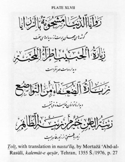
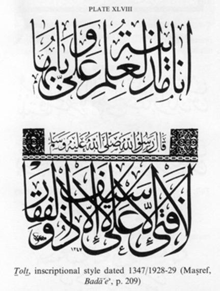
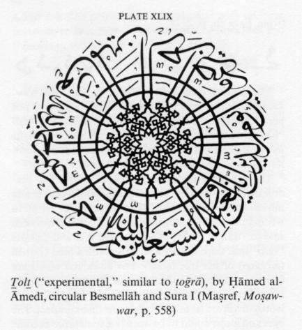
In Persia ṯolṯ was and still is used for headings of sūras of the Qurʾān, titles on spines of books, frontispieces, and chapter headings, and above all for inscriptions and tile work, where its beauty can best be seen and appreciated (Plate XLV, Plate XLVI, Plate XLVII, Plate XLVIII, Plate XLIX). Probably because it cannot be read by everybody it is seldom, if ever, used for Korans (except in the frontispiece, sūra headings, publication date, and colophon).
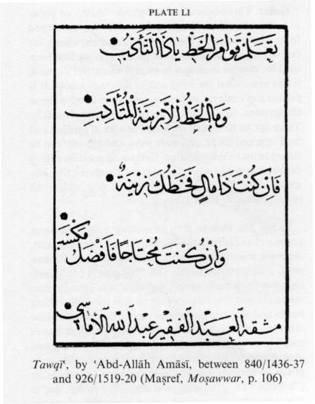
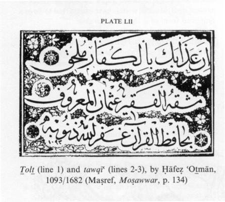
Tawqīʿ. This script is a derivative of ṯolṯ and acquired its name (lit. “signature”) because in medieval times it was used mainly for decrees, dispatches, and diplomas to be signed by caliphs or viziers, though sometimes also for more ordinary government documents. It was also used in colophons of the Qurʾān and other books, giving the name of the person for whom the manuscript had been written or was to be presented, the place and date of its completion, the name of the scribe, etc. The rules of tawqīʿ resemble those of ṯolṯ, but the letters are smaller, letter combinations more compact, and words more often joined together. The letters are of uniform thickness (without tašʿīr, see above) and rounder and deeper than in ṯolṯ. The “eyes” of fā, qāf, mīm, and wāw and the loop of lām-alef should ideally be open (fatḥ) but are allowed to be closed (ṭams) if necessary. Some of the letter shapes used are not found in ṯolṯ. The relatively small size of the letters makes tawqīʿ smoother and easier to write than ṯolṯ (Plate L, Plate LI, Plate LII). In Persia, the easier reqāʿ script gradually supplanted tawqīʿ.
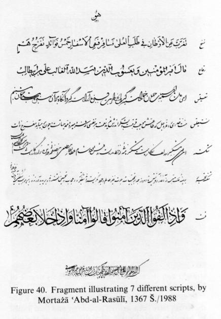
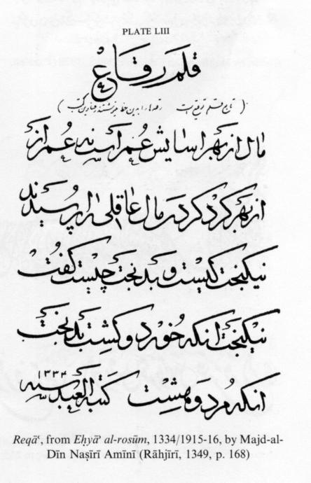
Reqāʿ. This script was developed from tawqīʿ as a simplified script to save time and space in writing short messages (roqʿa). The letters, whether detached or joined, generally have the same shapes as in ṯolṯ and tawqīʿ but differ in some respects: the size is smaller, and the eyes are closed (as in fā, qāf, mīm, wāw, lām-alef), though the loops of detached and initial ṣād, żād, ṭā, ẓā, ʿayn, and ḡayn are always kept open. The pen can be moved and turned more freely than in ṯolṯ or tawqīʿ and with a continuity and speed not possible in ṯolṯ. The strokes are mostly round, the proportion of straight to round strokes being less than 1:6. The letters, though small and short, are fully shaped and in that respect fat. Intertwining (tadāḵol) was not customary in reqāʿ, except when unavoidable, and regular spacing and consistent shaping of letters and letter combinations were in general strictly maintained, but even so some of the words in old reqāʿ manuscripts seem overly crammed. Ḥarakāt and ornamental frills were not normally used with reqāʿ, and when ḥarakāt were required they were kept to a minimum. Title pieces and colophons of the Qurʾān and other books giving completion dates and names of dignitaries and scribes were often written in reqāʿ. In the middle ages reqāʿ was widely used in most Muslim countries. In later times it gave way to other scripts in Turkey and the Arab countries but endured in Persia, where a few calligraphers still produce work in it today (Plate LIII, cf. Figure 40). Reqāʿ, as the successor to tawqīʿ, inherited the latter’s feature of the tuft at the top of certain letters. These tufts can be seen in some modern examples.
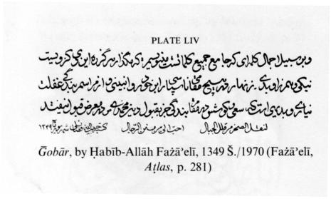
Ḡobār. This miniscule script (ḡobār “dust,” or ḡobār al-ḥalba “dust kicked up by horses”) was developed from reqāʿ and used, both in Persia and elsewhere, for fast writing on small pieces of paper. Having first been used for concise messages to be sent by carrier pigeons, it was also called the wing script (qalam al-janāḥ). It is precise and uniform, predominantly round and without elongations, very compact, and can be written quickly. There are no tufts, and the loops or eyes of median and final ʿayn and the fā, qāf, mīm, wāw, and lām-alef can be closed to make them smaller. Certain later calligraphers denied that ḡobār was a distinct script, arguing that any script could be made equally small (e.g., Mīr ʿAlī Heravī, chap. 1; Plate LIV).
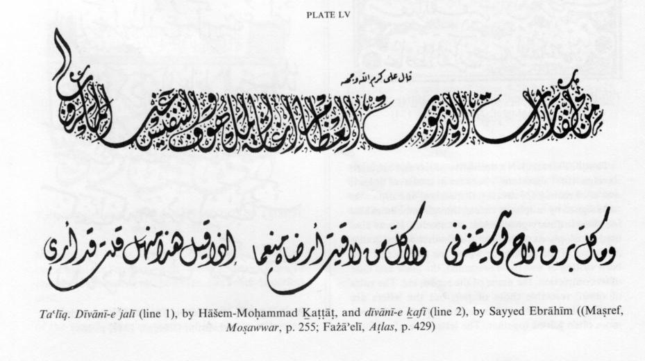
Taʿlīq. The Persian style of writing nasḵ underwent gradual changes from the 5th/11th century onward, and, in consequence of these and of an improvement in Persian pens, a script named taʿlīq (lit. “hanging”) containing elements from nasḵ, tawqīʿ, and reqāʿ was brought into use in the mid 7th/13th century. It was used for writing books and dīvāns of poetry and was further refined in the 8th/14th century. In taʿlīq words and detached letters could be joined, which allowed for speedy writing and made it suitable for official correspondence. For the early phase its correct, but less used, name is šekasta-taʿlīq (“broken,” i.e., truncated and simplified taʿlīq), and it was sometimes also called ḵaṭṭ-e tarassol (correspondence script). Modern writers have often given taʿlīq or a simplified form of it the name tarassol.
After the adoption and spread of taʿlīq the Ottoman Turks and the Egyptians introduced various changes to suit their tastes. Their style of the script acquired the name dīvānī because of its use in official business. It is still used in the Arab countries in two forms, jalī “large-sized” and ḵafī “small-sized” (Plate LV).
Taʿlīq has a special importance as the basis of the two principal scripts now in use in Persia, namely nastaʿlīq and šekasta-nastaʿlīq. Modern Persian calligraphers have little knowledge of taʿlīq and use it only occasionally.
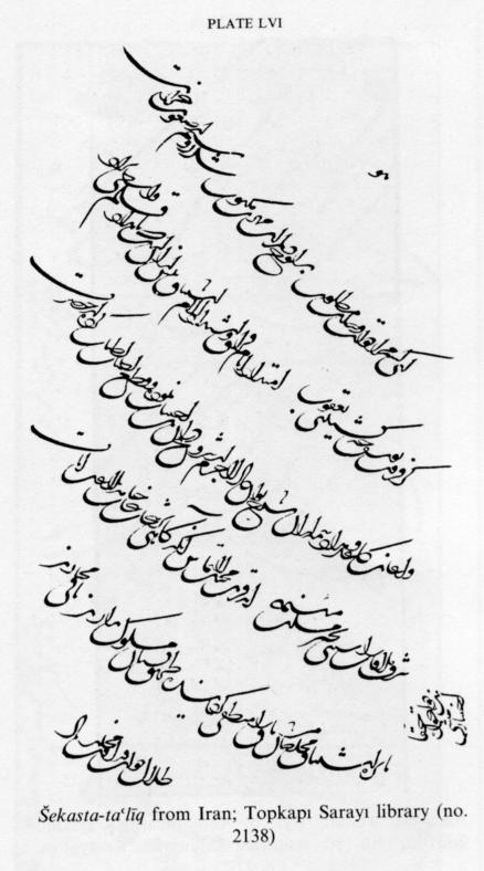
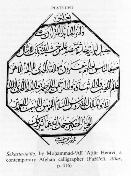
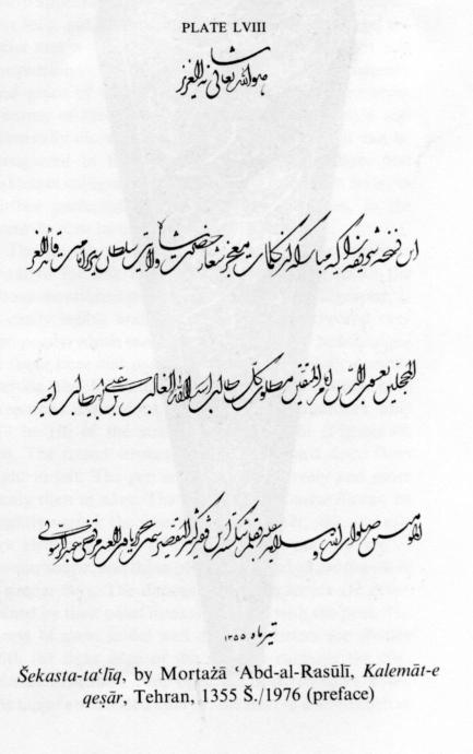
Šekasta-taʿlīq is said to have been invented, or at least defined, by Ḵᵛāja Tāj-al-Dīn Salmānī Eṣfahānī in the 9th/15th century and to have been perfected by Ḵᵛāja ʿAbd-al-Ḥayy Monšī Astarābādī later in the same century (see, e.g., Mīrzā Ḥabīb Eṣfahānī, p. 251). It is a script devised for rapid writing and therefore one in which intertwining is allowed, that is, unjoinable letters as well as two or more words are joined together. The strokes, except in certain contexts, are predominantly round, and the pen is moved smoothly. The sizes of letters and words are not uniform, and if there is any consistency in the composition, it is very different from the neat symmetry to be seen in other scripts (Plate LVI, Plate LVII, Plate LVIII).
The šekasta-taʿlīq script remained in fashion in Persian governmental and judicial offices for several centuries. It was used for both documents and books and by both clerks and calligraphers. From the early 10th/16th century onward it lost ground to the increasingly popular nastaʿlīq and šekasta-nastaʿlīq scripts, but it continued to be used until the 13th/19th century, Mortażā ʿAbd-al-Rasūlī, who wrote the inscriptions for the mausoleum of ʿOmar Ḵayyām at Nīšāpūr, wrote the Robāʿīyāt on the tilework in šekasta-taʿlīq instead of ṯolṯ conventionally used on tiles (Plate LIX).
Nastaʿlīq. In the second half of the 8th/14th century, another script called nastaʿlīq (from nasḵ-taʿlīq), which combined the well-balanced and nice-looking nasḵ script with taʿlīq, developed on Persian ground. This script did not have to be written slowly like nasḵ and was free from the shortcomings of taʿlīq. The regularity, firmness, and graceful flourishes of nastaʿlīq make it very pleasing to the eye. In some surviving taʿlīq manuscripts from the 7th/13th century a gradual shift toward nastaʿlīq is already apparent. Moreover, from the beginning of the 8th/14th century, the Persian-style nasḵ, which was the ordinary medium of handwriting in that period (see above), underwent changes that gradually brought it near to taʿlīq and ultimately gave it some resemblance to nastaʿlīq. Although most authorities, including Solṭān ʿAlī Mašhadī, state that nastaʿlīq was invented by Mīr ʿAlī Tabrīzī (d. 850/1446-47), this does not appear to be correct. It can be taken for certain, however, that Mīr ʿAlī Tabrīzī systematized and gave this script its definitive shape.
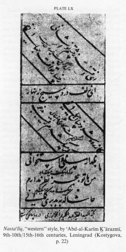
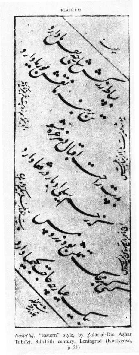
Two styles of writing nastaʿlīq came into use in Persia. One, called the style of Jaʿfar (Mīrzā Jaʿfar Tabrīzī Bāysonḡorī, 9th/15th century) or of Aẓhar (Aẓhar Tabrīzī, 9th/15th century, a pupil of Mīrzā Jaʿfar Bāysonḡorī at the Timurid court in Herat) earned much admiration and, after further refinement by Solṭān-ʿAlī Mašhadī, came into general use in Khorasan; for this reason it is known as Khorasani or eastern nastaʿlīq. The other was the style of ʿAbd-al-Raḥmān Ḵᵛārazmī and his sons ʿAbd-al-Raḥīm and ʿAbd-al-Karīm, who were calligraphers at the court of the sultan Yaʿqūb Āq Qoyunlū in the late 9th/15th century; it was used in the west and south of Persia and is known as western (ḡarbī) nastaʿlīq.
In the western style, the letters and words have a sharp appearance. The elongations are level and unusually long, and the semicircles are also rather large; the letter and word dimensions are on the whole not well proportioned; and thus it does not have the consistency and grace of the eastern (šarqī) or Khorasani style. Because of these imperfections the western style was eventually discarded in Persia, but traces of it can be recognized in the nastaʿlīq of Afghan, Indian, and Pakistani calligraphers (Plate LX). The eastern style, as further perfected in the following centuries, is the nastaʿlīq now in use in Persia (Plate LXI).
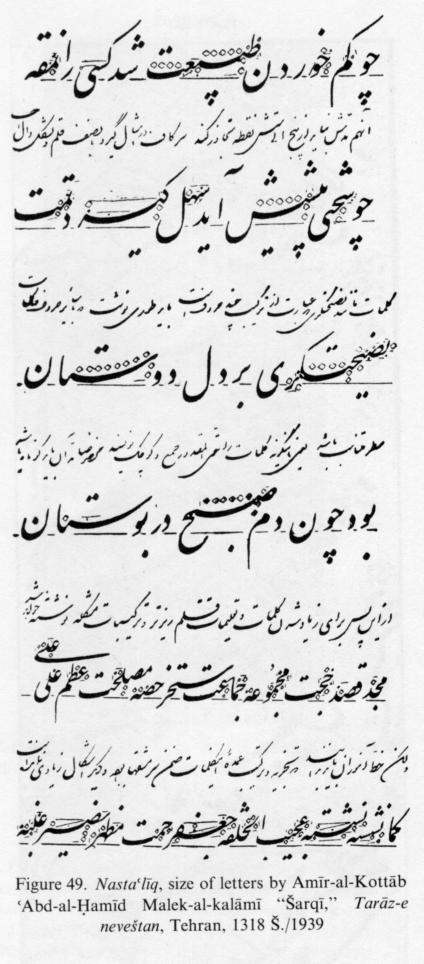
The popular nastaʿlīq script has all the qualities required for fine handwriting, conforming to all the above-mentioned principles and rules of calligraphy. It is easily legible and can be written quickly and very compactly, which enables more material to be contained in fewer lines and pages. The rules for writing nastaʿlīq include the following: The letters and words have prescribed dimensions. Roundness predominates, only 1/3 to 1/6 of the strokes being straight (Figure 48, Figure 49). The round strokes have a downward slope from right to left. The pen is moved more freely and more easily than in nasḵ. The semicircles in nastaʿlīq can be slightly varied: the flourishes of final sīn, ṣād, and nūn are identical, those of final ḥā, ʿayn, and qāf are of similar shape, and those of final lām and yā are drawn in a similar way. The dimensions of the letters are determined by their point measures (made with the pen). The starts of most initial and detached letters are written with the right edge of the nib, for example the cogs (dandāna) of sīn, the top of rā, the beak (menqār) of jīm, the top of an inverted final yā, the start of a word such as bīā, while in other scripts the starts of these letters are written with the full breadth of the nib. Whereas in ṯolṯ and some other scripts with large letters the blank spaces between the written matter are so extensive that they have to be filled up with oversized pointings and ḥarakāt and with decorative frills, nastaʿlīq is so compact that there is barely room for pointings and therefore no need for ḥarakāt and frills to fill voids. However, there is no risk of confusion between similar-looking letters and words. The ḥarakāt are only used in nastaʿlīq when necessary to remove ambiguity. Words are not joined in nastaʿlīq, except in inscriptions and calligraphy albums (moraqqaʿāt). In terms of regularity, clarity, and balance nastaʿlīq equals nasḵ and in writing speed taʿlīq, but in beauty and grace it is superior to both.
It is a popular belief that the letter shapes of nastaʿlīq were inspired by nature or music: the vertical strokes by trees and flowers, the round strokes by the undulations of hills and meadows or of treble and bass in singing, the elongations by fields and plains or by musical pauses, the sinuosities of letters and words by the bodily contours of animals, birds, and in particular humans, the sentence arrangement by flights of birds or clusters of flowers (see Fażāʾelī, 1350, p. 603, n. 2). Human features and postures are most likely to have been a source of inspiration because in Persian poetry the beautiful features of the beloved are often likened to letters of the alphabet.
The beauty and strength of nastaʿlīq lie in the balanced distribution of thick and thin, open and closed, and short and tall strokes, in the graceful shaping of the letter and letter combinations, and in the symmetry and consistency with which the letters and words are juxtaposed. The letters and words may even seem to dance, sometimes holding hands, sometimes embracing. Integration of a fine piece of calligraphy, such as a familiar verse or proverb written in nastaʿlīq, with a painted illustration or an illuminated background can produce very beautiful works of art.
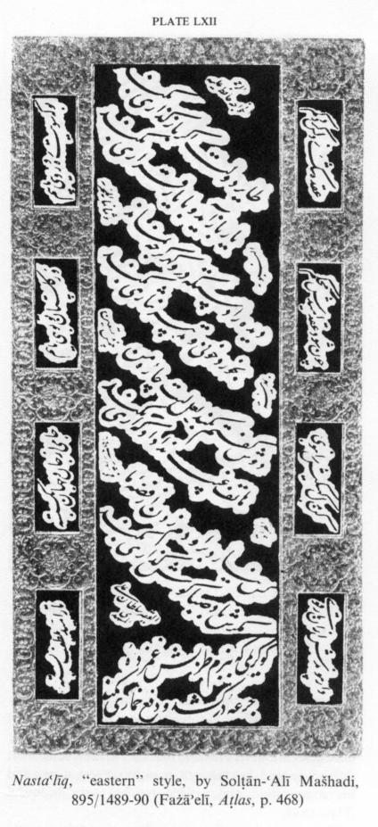
From the early 9th/15th century onward Persians did most of their writing in nastaʿlīq. The Muslim Indians, Ottoman Turks, Egyptians, and others also recognized the merits of nastaʿlīq and adopted it to some extent. The great age of nastaʿlīq in Persia was the first half of the Safavid period, which witnessed the work of the great calligraphers Solṭān-ʿAlī Mašhadī (d. 926/1520; Plate LXII) and Mīr ʿEmād Ḥasanī Sayfī (killed 1024/1615; Plate LXIII). Most branches of art in Persia, including calligraphy, were set back by the troubles and wars of the 12th/18th century, but they afterwards made some recovery. Calligraphy, and therewith nastaʿlīq, again received attention, particularly in the second half of the 13th/19th century, when such masters as Mīrzā Moḥammad-Reżā Kalhor (1245-1310/1829-1892-93) produced excellent work. In the 14th/20th century the use of nastaʿlīq declined. After World War II, however, interest in calligraphy and above all in nastaʿlīq revived, and some outstandingly able masters of the art have since then emerged. Large numbers of people now take lessons in it, mainly at classes run by the Anjoman-e Ḵᵛošnevīsān-e Īrān (Association in Persian Calligraphers), which has branches in all the chief towns.
Modern nastaʿlīq is essentially the same as that which Mīr ʿEmād described in the 11th/17th century, but the calligraphers of the 13th/19th and 14th/20th centuries have of course added their own artistic touches.
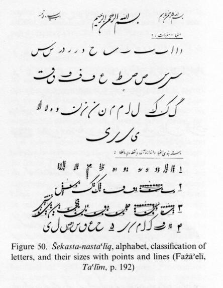
Šekasta-nastaʿlīq and šekasta. The increasing use of nastaʿlīq and consequent need to write it quickly exposed it to a process of gradual attrition. The šekasta-nastaʿlīq which emerged in the early 11th/17th century and spread in the later Safavid period consequently differed from proper nastaʿlīq only in so far as some of the letters were shrunk (šekasta, lit. “broken”) and detached letters and words were sometimes joined. Manuscripts from this phase show signs of the influence of šekasta-taʿlīq; while having the appearance of a shrunken form of nastaʿlīq, they also contain features of taʿlīq due to their being written by scribes who had been trained in taʿlīq. The product of this mixture came to be known simply as šekasta, and being more easily legible than taʿlīq it gradually replaced the latter as the script of decrees and documents and later also came into use for writing books, poems, albums, etc. Certain features of šekasta can be traced back to experimental devices (tafannon) used by scribes of ṯolṯ, to ornamental letter shapes found in rayḥān and moḥaqqaq, and to decorative styles of secretarial (tarassolī) nastaʿlīq used in official documents of the Safavid and Timurid periods. Traces of some of the letter combinations of šekasta have been found in various styles of Ottoman dīvānī calligraphy (Moẓaffar Baḵtīār, p. 86, quoting Mahmud Yazir, pp. 129-55).
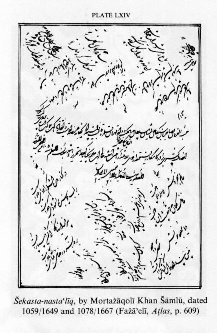
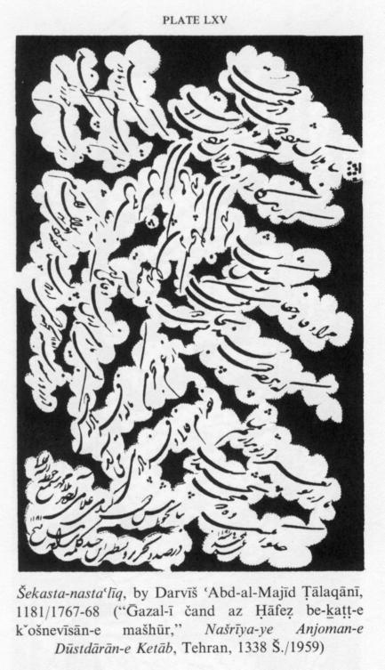
Two main styles of šekasta handwriting can be distinguished: one that is simple and clear, another complex. The latter is sometimes called “correspondence script” (ḵaṭṭ-e tarassol). In its first phase, for instance in the work of Mortażāqolī Khan Šāmlū (d. 1100/1688-89), šekasta lacked consistency, being a mixture of taʿlīq, nastaʿlīq, and šekasta, and contained letter combinations which were afterwards dropped (Plate LXIV). Mortażāqolī Khan Šāmlū and Moḥammad Šafīʿ Heravī Ḥosaynī known as Šafīʿā (d. 1081/1670-71) produced beautiful work in early šekasta and were pioneers of šekasta calligraphy. It reached the peak of artistic perfection in the work of Darvīš ʿAbd-al-Majīd Ṭālaqānī (d. 1185/1771), who gave the script its distinctive and definite form. His pupils and followers and other interested calligraphers successfully promoted the spread of the script and use of his special style, which is still the norm today. There are some intricacies in Darvīš’s šekasta that may make it somewhat difficult to read, but his craftsmanship is very strong and his composition and artistic touches very beautiful (Plate LXV).
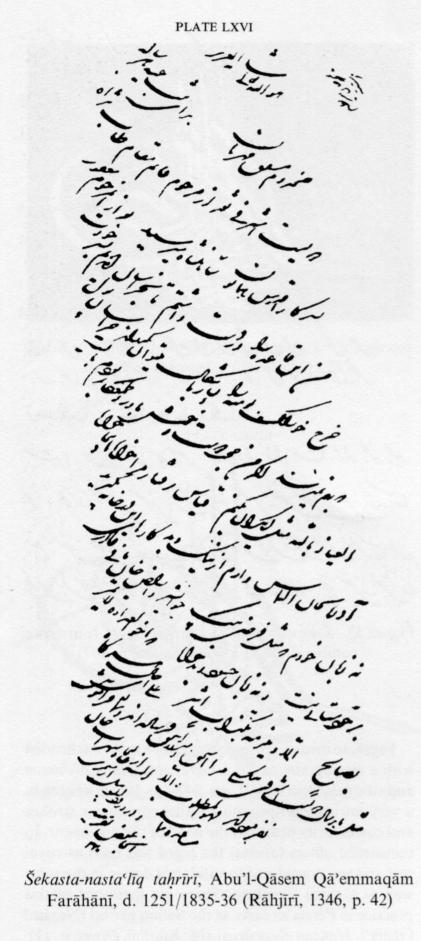
The use of šekasta for writing decrees and documents and for many other purposes prompted clerks and scribes to add frills which made it unduly complex. Eventually the need for simplification was recognized, and several new styles emerged, the best known being the secretarial styles (šekasta-ye taḥrīrī) of Abu’l-Qāsem Qāʾemmaqām Farāhānī (q.v.; d. 1251/1835-36), Ḥasan ʿAlī Khan Amīr(-e) Neẓām Garrūsī (1236-1317/1820-1900), and Mīrzā ʿAlī Khan Amīn-al-Dawla (q.v.; 1260-1322/1844-1904). Qāʾemmaqām, who also played a big part in simplifying the Persian prose of his time, assimilated the elements of šekasta to those of nastaʿlīq, thereby making šekasta simpler and greatly increasing its popularity (Plate LXVI). Amīr Neẓām Garrūsī also made an important contribution, particularly by showing how šekasta could be made thinner and neater. Amīn-al-Dawla’s style, however, made šekasta more difficult to read and was therefore, despite its beauty, soon forgotten. The secretarial style (ḵaṭṭ-e taḥrīr) is really a simplified form of šekasta adapted for ease and speed of writing and reading. Proper šekasta is more artistic.
For speed of writing, šekasta stands first among the scripts. It is elegant, being predominantly round with few flat strokes. The movement of the hand and pen is less constrained than in nastaʿlīq. The ḥarakāt are not inserted unless absolutely necessary. The vertical letters are relatively short, and the final flourishes of sīn, ṣād, qāf, and nūn may be stretched out instead of being written in the usual semicircular form. There are three different forms of final lām, nūn, and yā. The loops of ḥā and ʿayn are somewhat more open than in nastaʿlīq. The oblique crossbars of kāf and gāf are longer than in nastaʿlīq and not always attached to the letter. Elongations are more often used than in nastaʿlīq (Figure 50). Not infrequently an unjoinable letter is attached to what follows.
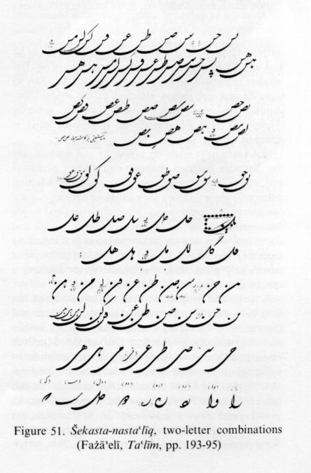
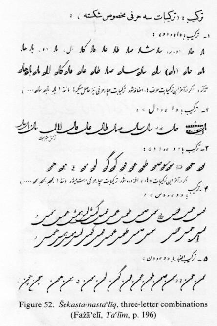
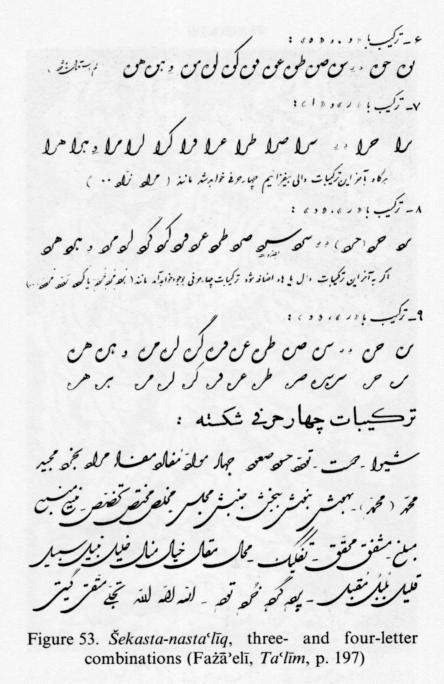
In šekasta, as in nastaʿlīq, simplicity and legibility are the desirable qualities. Exaggerated joining of words and letters, omitting of diacritical points, and letting differently shaped letters have the same appearance are considered bad faults (naqṣ). When the letters and words are consistently shaped and have uniform heights and slopes and when they are juxtaposed so as to stand nicely together, something which for this script requires particularly great skill, the šekasta script acquires a special grace and beauty (Figure 51, Figure 52, Figure 53).
A rough and irregular form of the šekasta script has long been used in governmental and other offices and institutions in Persia for writing letters, reports, and so on. Degenerating in the first half of the 14th/20th century, it has now again engaged the attention of calligraphers. In other Muslim countries also, particularly Afghanistan, the šekasta script is used, but not according to the Persian norm and sometimes only as experimental devices (tafannon). In Afghanistan the simple form is called šekasta-āmīz, and the complex form šekasta.
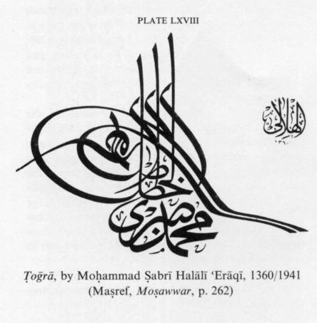
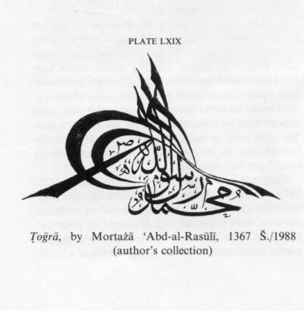
Ṭoḡrā. In medieval times an edict of a ruler was headed with a monogram, called a ṭoḡrā, containing his name and title (see Doerfer, III, pp. 342-46). It was written in a very intricate script with parallel curvilinear strokes and customarily placed at the head of the document. In ministerial offices (dīvāns) the ṭoḡrā was used as royal seal and was considered to validate a decree in the same way as a royal signature. There are mentions of this practice in Persia as early as the Saljuq period (Neẓāmī Ganjaʾī, Maḵzan al-asrār, p. 108; Ḵāqānī, Dīvān, p. 11). The ṭoḡrā was at first confined to headings of royal edicts, coins, seals, and agate signets, but in late medieval and modern times it was more widely used. As can be expected, the early ṭoḡrās are not written in any particular shape. Ottoman calligraphers, however, developed a special form of ṭoḡrā, which differs from the forms found in decrees of the Safavids and Nāder Shah Afšār. The designs of ṭoḡrās are usually derived from the ṯolṯ, reqāʿ, or dīvānī scripts. There are still some calligraphers in Muslim countries such as Egypt, Syria, Lebanon, Iraq, Persia, and Afghanistan who dabble with ṭoḡrās as well as other ornate styles of writing. In Turkey the ṭoḡrā fell out of use after the abandonment of the Arabic script. In the opinion of some authorities (Fażāʾelī, 1350, p. 646) any specially designed ornamental heading, whether in Kufic, ṯolṯ, nasḵ, nastaʿlīq, šekasta, or dīvānī, may be designated as a ṭoḡrā or semi-ṭoḡrā (Plate LXVII, Plate LXVIII, Plate LXIX and cf. Plate XLIX).
III. Ornamentation.
Calligraphic ornamentation is done in several ways: by making the piece itself ornamental by writing its contents in a geometrical or pictorial form (e.g., ṭoḡrā); by providing simple ornamentation, such as a pale-colored or gold-speckled background; or by inserting ornamental devices: jadwal, kamand, tašʿīr, toranj, sar-lawḥa, ḥāšīya and lačak-sāzī.
A jadwal consists of usually three closely adjacent parallel lines enclosing the written matter in a rectangular frame. The middle line is usually drawn thicker and in a bright color such as orange-yellow or gold; the outer and inner lines are usually thinner and colored black or dark blue. If the written matter looks too small in relation to the size of the page, another border, thinner than the main one, is added further away; such an outer border is called a kamand (lit. “noose”). The space between the inner and outer borders is often filled with decorative matter such as tašʿīr (hair-pin representations of flowers, shrubs, or sometimes animals) or with gold illumination. Frontispieces and chapter headings of manuscripts are specially adorned with colored margins (ḥāšīya) and intricate vignettes (sar-lawḥa). The designs of these vignettes are symmetrical and have a special beauty, looking like intertwined and outspreading branches of a tree. If the illumination of a ḥāšīa or sar-lawḥa is only in color, it is called moraṣṣaʿ, if in gilt moḏahhab, if in a combination of gilt and color moḏahhab-e moraṣṣaʿ. For the back of the frontispiece there is a special form of ornamentation consisting of a large medallion (toranj, lit. “citron”), in the middle of which are written the book’s title and the author’s name, and two small medallions or half-medallions called sar-toranj, standing above and below the main medallion and sometimes joined to it. In addition quarter-medallions, called lačak (lit. “kerchief”), are placed in each comer of the page. A similar design can be seen in certain carpets and on portals of mosques and shrines. The terms toranj and lačak-e toranj are also used in carpet weaving.
IV. Inscriptions.
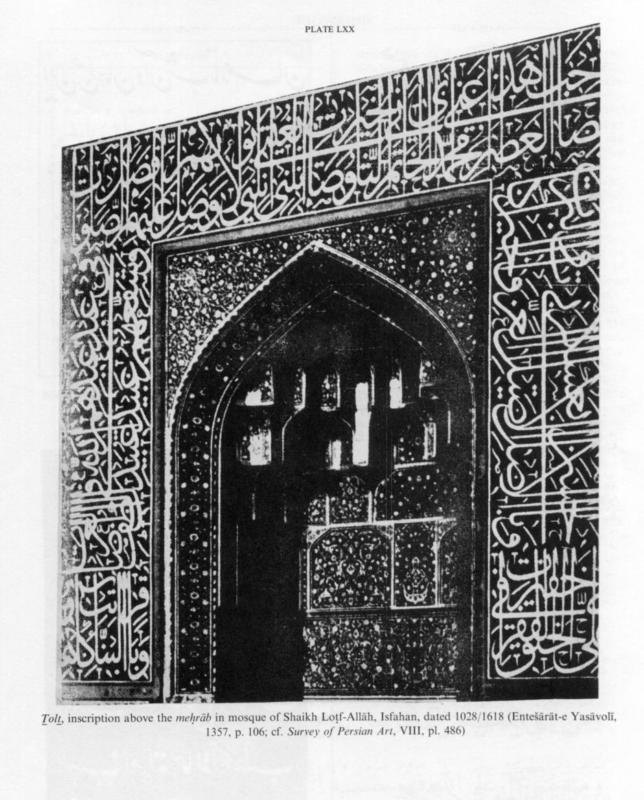
Inscriptions (katība, a palatalized variant of Arabic ketāba “writing”) are first written by the calligrapher on paper in large, clearly drawn letters and then transferred to the slab of stone or the tiles. They are placed on façades, walls, and portals of mosques, shrines, and important secular buildings. They are most often written in ṯolṯ, because its sinuous roundness and its bold, large letters, which make it suitable for decorative purposes and easy to fit into patterns of tilework or designs of carved inscriptions, but all other scripts are also found. The texts of the numerous inscriptions to be found on Persian buildings are often verses from the Qurʾān, sayings (ḥadīṯ) of the prophet Moḥammad, poems, chronograms, construction dates, founder’s names, and the like (Plate LXX).
V. Painting and calligraphy.
Since the 1340s Š./1960s certain calligraphers have attempted to combine calligraphy with painting and to employ calligraphy in the service of pictorial art or vice versa. In some cases they have produced fine and original works of art. Many leading calligraphers, however, regard this as a questionable innovation and class it as painting, not calligraphy.
VI. Writing implements and materials.
The implements and materials needed for good handwriting have long been considered very important and are discussed in detail in the treatises on calligraphy. In former times the calligraphers themselves had to prepare their materials and tools, for instance blend their ink, treat their paper, make their rulers (melasṭar), etc.
For convenience in their work, calligraphers keep the necessary pens and a penknife, qaṭṭzan, small spoon, whetstone, and scissors for cutting paper in a special case (qalamdān), to which an inkwell is often attached at one end. The lid is sometimes ornamentally painted (Kühnel, 1963, p. 81; S. Bayānī, figs. 18, 19).
Only reed pens (qalam) are used. The reed (nay) ought to be moderately mature, the degree of its maturity being judged from its color, which should be completely brown outside and white inside. It should be straight, fine-grained, free from bends and knots, hollow, white inside, and not too long, too short, or too heavy (details in Kühnel, 1972, p. 80). To cut the nib, one must proceed by stages: remove the part over the nib, trim the sides of the nib, split the nib (fāq-e qalam), clip (qaṭ[t]) the tip of the nib, and pare the back of the nib if the pen is too thick. Nibs must be cut with different widths and degrees of sharpness for writing different scripts with large and clear or small and faint lettering.
Calligraphers use two sorts of penknife (qalamtarāš) to prepare their pens: a broad, rigid knife to remove the part below (from the start to the tip of) the nib and also to clip it, and a second knife, which has a narrow blade but must also be rigid, to taper the tongue of the nib and sharpen the tip. For sharpening the penknives a whetstone (sang-e rūmī or sang-e ḥejāzī) is required.
The qaṭṭzan, used in nib cutting, is an implement about as long as a finger and 1.5 cm wide, made of a smooth hardwood such as ebony or of ivory, bone, horn, or in recent times vulcanized rubber. The user holds the tip of the nib on the qaṭṭzan and clips it by pressing the blade of his penknife against it.
After the pen has been cut, the back of the nib is rubbed against a small vessel containing fine sand (the sprinkler, alak) to prevent it from being too slippery and thus to ensure that the ink will not pile up at one end. After writing a cloth of wool or silk, colored and reversible, is used to clean the nib and prevent ink from drying on it,
The inkwell (dawāt) contains both ink (morak-kab) and wadding (līqa, porz). It is preferably shallow and with a wide opening. The ink may be deep black, ordinary black, grayish black, or a black verging on green called sīāh-e ṭāwūsī (peacock black). From old the manufacture of ink and ink colors have had their own principles and customs, set down in some of the treatises on calligraphy (see Fażāʾelī, 1366, pp. 370-92; S. Bayānī, pp. 203-56). Today Persian calligraphers prefer inks made in Persia or other Muslim countries. The wadding consists of twisted silk fibers and is steeped in the ink so as to allow sufficient ink to get onto the nib and to prevent spillage or drip. For stirring the ink and pressing the wadding into it, a flat-headed, conical tool is used, preferably made of ebony. A small spoon is used for putting a liquid into the inkwell to thin the ink, preferably not water but essence of rose or sweet basil or oak-apple tannin, as they do not spoil the ink.
As calligraphy is affected by the quality of the paper, particularly its smoothness, instructions on varieties of paper and methods of dyeing it, stiffening it with starch (āhār dādan), and glazing (mohra zadan) it are given in the manuals (e.g., Ṣayrafī, pp. 32-42; Fażāʾelī, 1366, pp. 357-70). The paper is placed on a writing pad (zīrdastī or zīrmašq) made of cardboard or leather such as goatskin. It must be level and smooth and is usually not large.
To draw lines a ruler (ma/esṭara or ma/esṭar) was employed. It was a suitably sized board of bonded paper sheets or cardboard on which threads corresponding to lines were fixed at the required distances apart. The board was placed under a sheet of writing paper, the sheet was pressed against it, and the indentations made by the threads on the sheet served as lines and limits for the text that was to be written. Today this method has been replaced by the use of ruled sheets which show through the writing paper and thus enable the writer to keep his lines straight.
For carving inscriptions on stone special tools such as large and small calibrated rulers and mason’s squares are required.